Holding a calligraphy pen may feel daunting at first, but don’t be afraid to experiment and get a feel with holding the pen and practice with swirls. Confidence building will help your technique with handling the pen. Start with writing and drawing some simple shapes. Try to hold the pen nib at a consistent angle, as a rough guide, about a 30 - 45º angle.
It is helpful to start with simple but interesting letter forms, such as rounded letters. Many people like to start with basic but very neat handwriting and swirls to get them started and to become familiar with the calligraphy pen and how it feels on the paper.
View the YouTube videos for more ideas, hints and tips shown on the link list on the right.
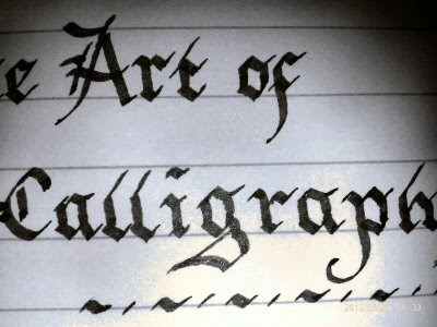
 Practice Handwriting In Calligraphy

Use lined paper and write in even and neat forms, take you time with this and you will get the feel of the pen.
Straight Sided Letters With Arches
Straight Lined Letters with arches; such as n, m, h, r, a, and i are upright and straight letters. These letters are about ¾ width, except the letter m, which is double the width, and the letter, i that is only a single stroke.
Different Types Of Letter Forms
Lowercase letters have different types of letterforms as described below:
Circular And Rounded Letter Forms
These letters have no top or tail and they are all the same height. These letters are the letters a, c, e, i, m, n, o, r, s, u, v, w and x
When planning your work, you have to bear in mind that letters have very different width sizes, for example, the letters m and w are fatter than the letters i and I and you have to use your ‘artistic eye’ e.g. artist license to make your calligraphy look right, even though they have very different widths.
Ascending and Descending Letter forms
Ascending means an upward stick or an upward stroke. These letters are the letters b, d, h, k, l and t. Descending letters are letters with a tail. These letters are f, g, j, p, q and z. With ascending and descending letters, you can really elaborate on the strokes to make really effective swirls and scripts to set off your calligraphy.
There are no rules to the height of tops and lengths of tails but as a rule of thumb, they are normally just under the height of the rounded letter forms.
No comments:
Post a Comment